Dap Events
Messaging-based Events Platform
Overview
Create events in seconds, share on any messenger
During my 1 year at Adept Interactions, I was part of this challenging post-COVID project called Dap Events, aimed at bringing people closer together via a simple and frictionless event platform. This product launched last November!
Client
Dap Events (Adept Interactions Inc.)
Team
Hiral Parekh, Leo Ohannesian (Co-founder, Product Manager), Henry Hwang (Co-founder, Developer),
Yukie Park (Brand Designer)
Tools
Sketch, InVision, Zeplin, Adobe Illustrator, Trello
Timeline
February 2020 - January 2021
My Role
UX / UI Designer, Intern
- Designed a mobile application for an ultra-shareable, messenger-based events platform
- Conducted 25 user interviews to discover pain points and 30 user testing sessions to validate design decisions
- Collaborated successfully with designers, a PM, and developers to deliver an optimal mobile application
- Created a brand profile and illustrated graphics
Featured
Problem
Efficiently meeting loved ones in person (and virtually)
During the pandemic people had started feeling lonely and were craving for meaningful social contact.
Goals
Provide a frictionless event creation and communication experience
01
Bring people together in the most simple way possible
02
Reduce the barriers to entry in getting together
03
Simplify the event management space by easy communication and coordination
Solution
An ultra-shareable messaging-based events platform
Create an event in a few seconds
With just a few taps, create an in-person or virtual event to share with your friends
Invite anyone to any event
Invite any friend no matter what social platforms they’re on (or not on)
Friends accept with just a phone number
No need to download an app; all they need is a phone number to accept
Communicate key event updates
You can update event details, what to bring, and more through text
LET’S DIVE DEEPER
Approach
Lean UX, Agile approach
The core objective was to focus on obtaining feedback as early as possible so that it can be used to make quick decisions and roll out the MVP in the market.
Desk Research
Being picky while meeting people
Due to COVID, people are practicing social distancing in both indoor and outdoor spaces. People are meeting mostly virtually and limiting their in-person interactions to a few repeated contacts (5-10 people or larger) they trust.
The Competition
Facebook, Evite, Paperless Post, Google Calendar are direct competitors
All these are platforms to create and manage events. However, some require a lengthy sign up process while some are not easily shareable unless you have someone’s email address saved or your friends have an account.
User Research
Understanding user mindset via interviews
I conducted 15 structured remote interviews with potential users of our product. This helped me understand participant preferences and attitudes around creating events and meeting people in post-COVID times.
User Personas
3 types of users and their needs
Samantha the Urban Socialite
Has a few groups of friends
Typically meets in the city
Usually updates all of them separately about when she’s hosting drinks
Asks many of them individually to bring additional wine if they’re running short early on
David the DJ
Often schedules live streams for DJ shows on Zoom
Sends the Zoom link, and messages them if there’s a change in time
Doesn’t get to thank everyone for coming
Sam the Soccer Player
Hosts soccer at local park
Needs people to typically bring a ball, small nets, cones, and jerseys
Difficult to plan who is coming, what they’re bringing
Target Audience
Millennials and Gen-Zs (21 - 35 yrs old)
- feeling most lonely during the pandemic
- value human connection over digital connection
- do not use Facebook often but did at some point, now use a mix of Instagram and Snapchat
Information Architecture
Developing the site map
We started with brainstorming the main features and the initial content categorization for the application.
Brainstorming on Zoom
Initial Site Map
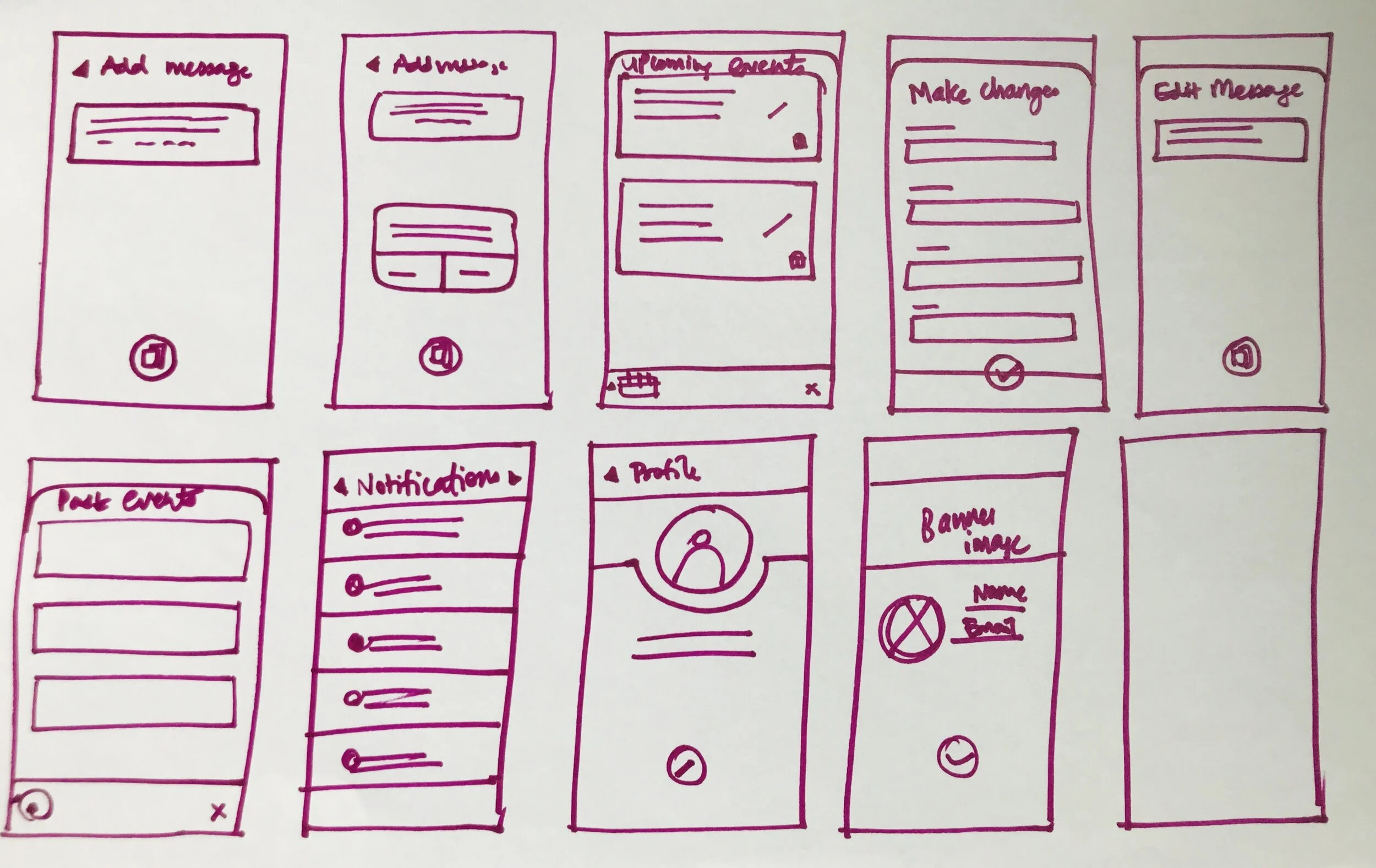
Sketches
Getting a basic concept of the user interface
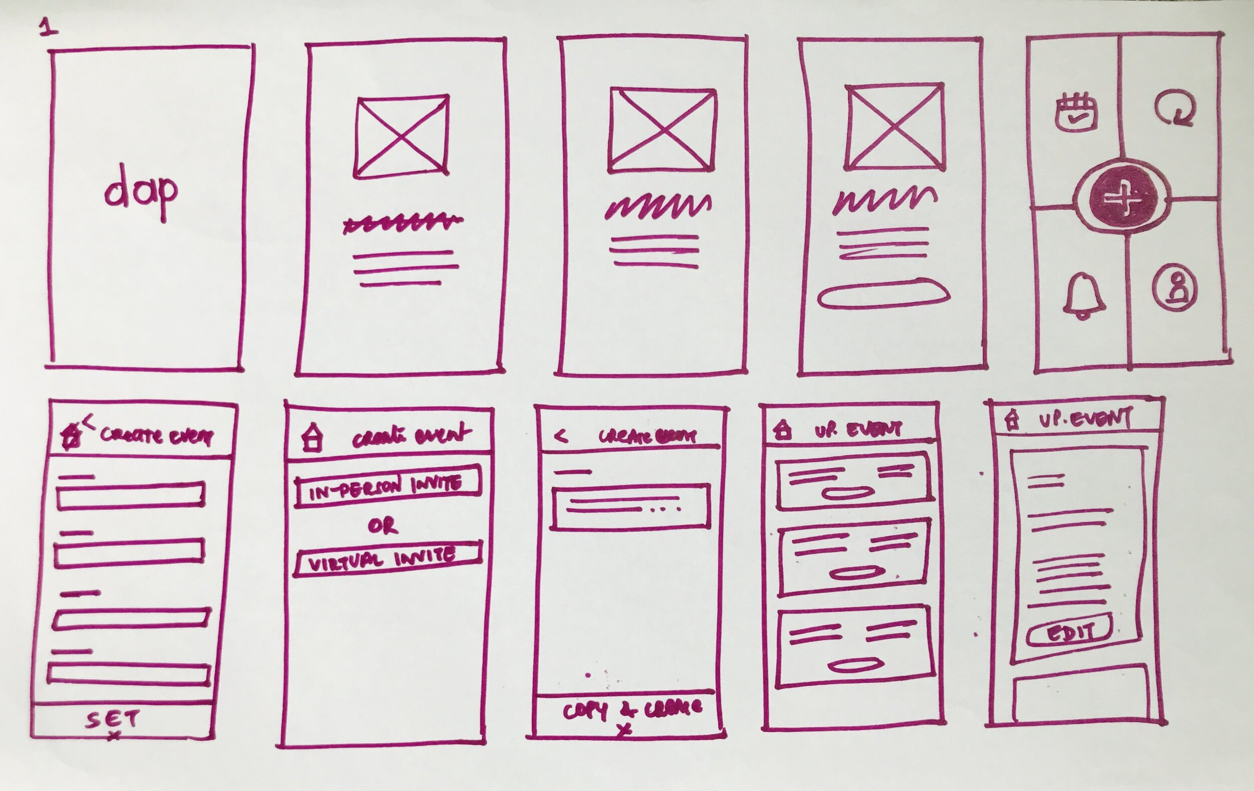
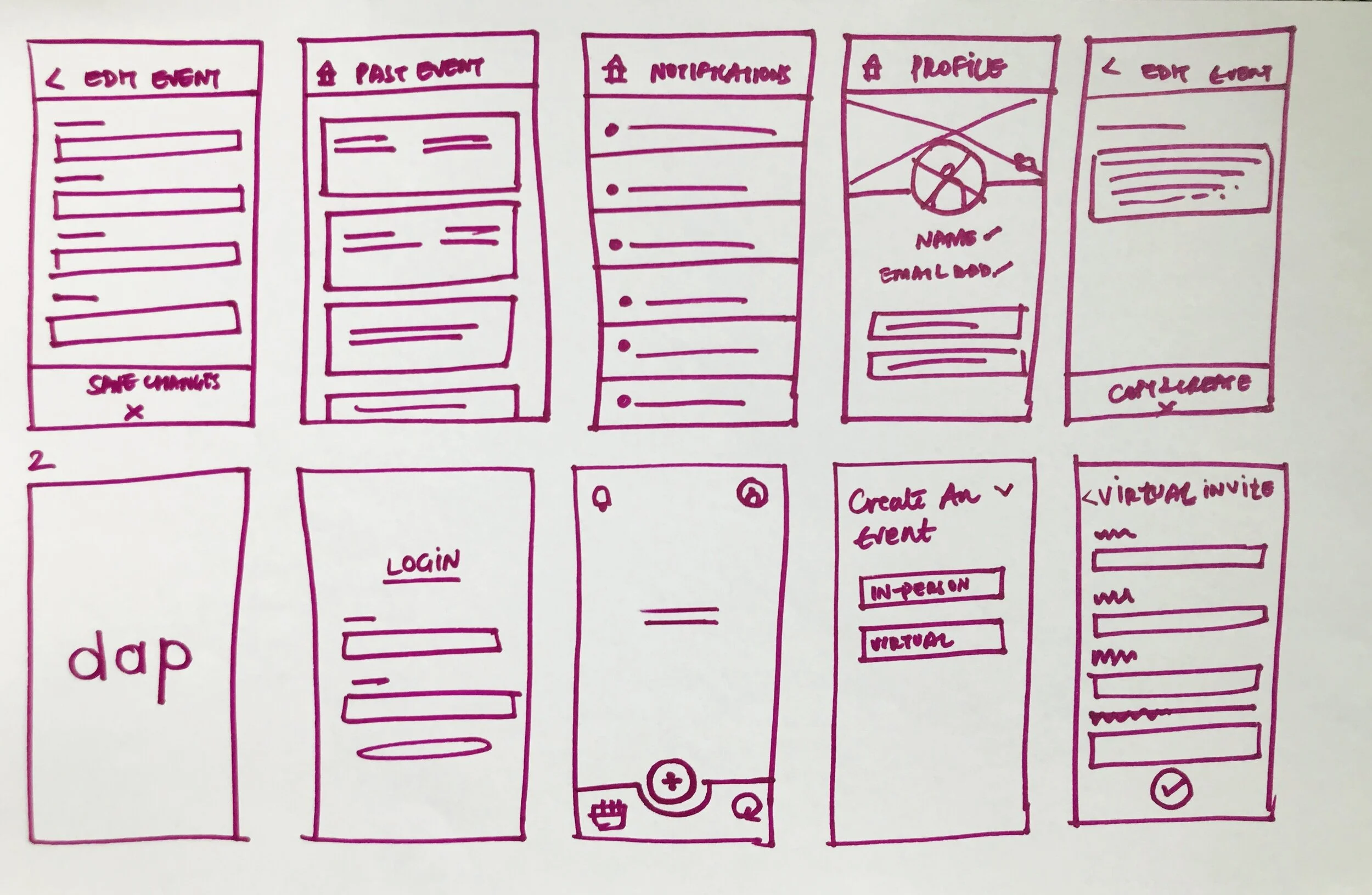
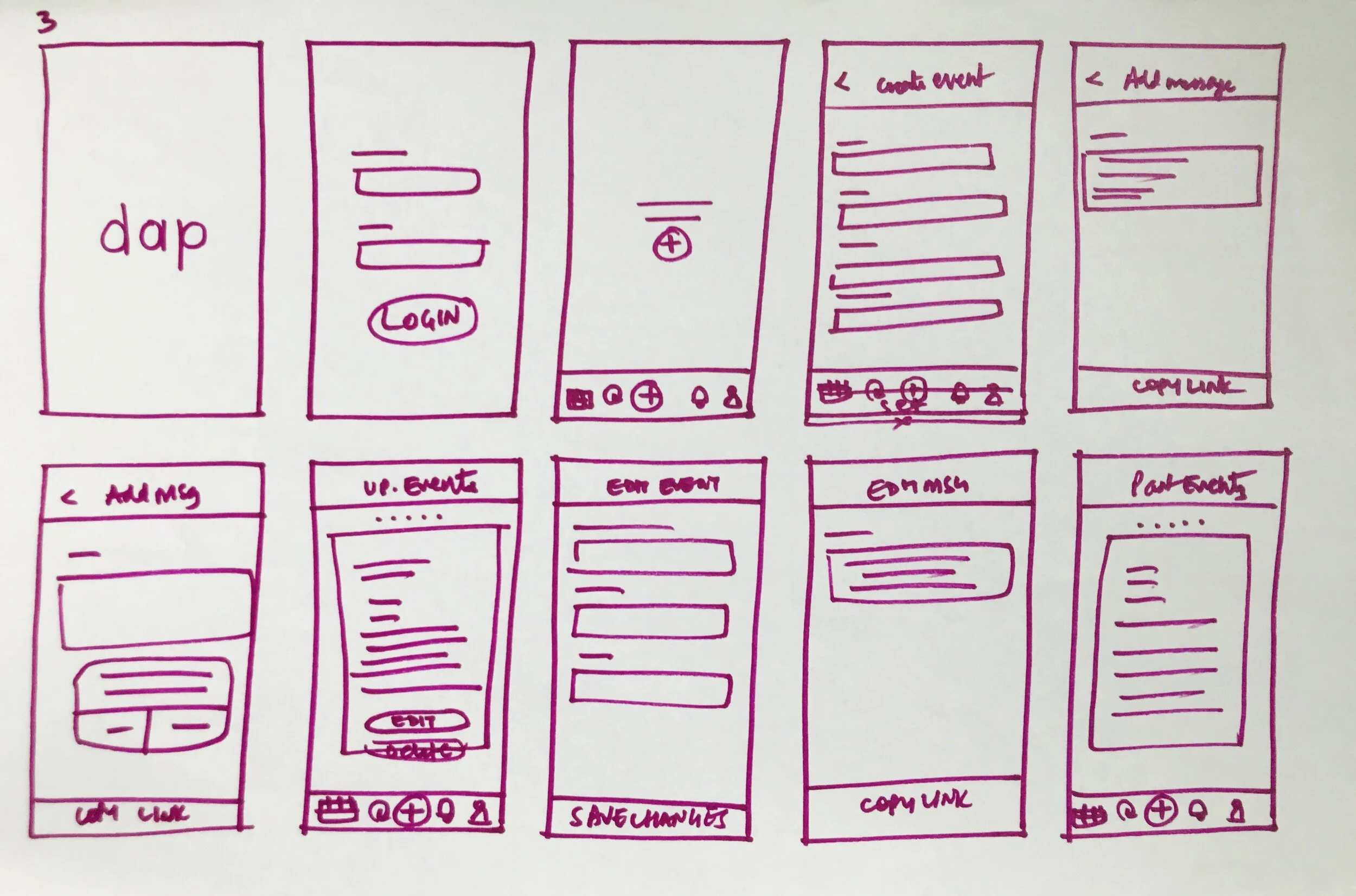
Sketching helped me explore different options quickly so that I could figure out the best design directions.
Voting Feature Sketches
Low-fi Prototype
Testing Balsamiq wireframes to decide the basic structure
I laid out the content and functionality of the app in 3 different ways using Balsamiq wireframes.
Option 3
User testing option 3
User Testing
I conducted a quick multivariate testing of those 3 design options with 15 potential users to establish the basic structure of the app before visual design. The tasks were
Create an event
Edit an event
Insights
Option 3 received 100% success rate, option 2 85% and option 1 received 75% success rate
75% users preferred bottom navigation
60% users did not prefer having an event log
Hi-fi Wireframes + Branding
Finishing up with visual design
We did a quick group session to brainstorm words that describe the app and then chose colors accordingly. Once that was decided, I quickly refined the wireframes into hi-fidelity designs.
Hi-fidelity app screens
Early release
Testing the app within the team and externally for further improvement
We released the app internally between Leo, Henry and myself. We tested out the app for 1 week by creating events, inviting friends and taking their feedback and then used the Trello app to keep track of everything from the big changes to the minute details.
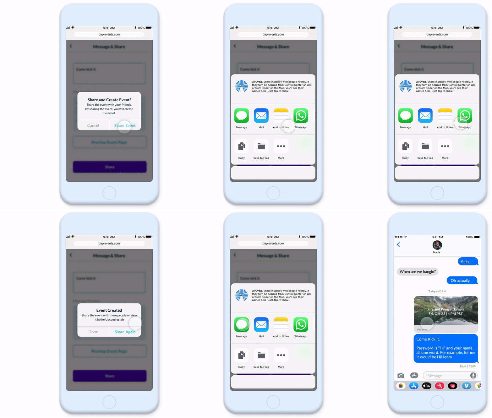
Sharing the invite link on iMessage
Users do not check their email address regularly but they do check their messages/sms. So this led to making Dap a messaging-based platform
Rebranding
Redefining the app's look and feel
Based on user feedback, we realized a chats events app tested positive and so we took the time to refine and rebrand.
Moodboard (top) and New Color Palette (bottom)
Changed the placement of previous and next buttons from center to on the left and right extremes for better thumb control
Final Avatar
The redefined version of the app
Main Screens
Illustrations
Designing fun illustrations for marketing purposes
I created these 5 illustrations for Dap's advertising; one hero image and 4 others to showcase the key features of the app.
Create an event in a few seconds
Friends accept invite with a phone no.
Invite anyone to any event
Communicate key event updates
Learnings and Takeaways
Do not fall in love with your ideas
When I joined Adept Interactions, they were working on another product called Daplr that was based on offline communications. But just before we could release the Beta version, COVID-19 hit and we had to pivot completely. This taught me a wonderful lesson - Not to fall in love with my ideas and be quick on my feet to start fresh.
Product Managers and developers can be good designers
It is important to talk to the development team early in the process to get their inputs as well as find out the limitations of the design. Leo (PM) and Henry (developer) have surprisingly provided some really easy and thoughtful design suggestions.

