Fighting Cell Phone Addiction
Overview
Mitigate excess phone usage among teenagers
Teens are expected to use technology both in and out of the classroom to make the grade. They manage their social lives through various apps and social media platforms. In these conditions, how might we help teens avoid developing cell phone addiction? This project addresses this issue and derives a solution using teens' emotions and phobias.
My Role
UX Designer
Tools
Adobe Illustrator
Timeline
October 2018
Problem
50 percent of teens “feel addicted” to mobile devices
Results of a 2016 Common Sense Media Report found that 50 percent of teens “feel addicted” to mobile devices. This survey also showed that 72 percent of teens feel the need to immediately respond to texts, social-networking messages, and other notifications; 78 percent of teens check their devices at least hourly.
Goals
Limiting cell phone usage among teenagers gradually
Goal 01
Make teenagers want to reduce their usage of cell phones
Goal 02
Help teenagers optimize their phone usage based on importance
Goal 03
Provide a long-term solution to cell phone addiction
Solution
A personalized heat-sensitive cell phone case that discloses the user's phobias when the phone is used too much
Using human psychology for human benefit
If we are afraid of something, we tend not to do it. At times when there is no option, we prioritize and make sure if it really needs to be done in spite of our fear. This is the psychology behind this solution to fight cell phone addiction. Excess heat = excess usage of cell phone. This heat-sensitive cell phone case will reveal the teenager’s greatest fears when the heat from their hand is passed onto the cell phone case. This will help them optimize their phone usage.
LET’S DIVE DEEPER
Process
Desk Research + Ideation + Design + Iteration + Prototype
I started the provess with online research and gradually moved on to translating the problem into an effective solution through multiple iterations.
Desk Research
Studying about teenagers and their cell phone behaviors
A 2018 Pew Research Report showed that 45 percent of teens said they use the Internet “almost constantly,” and another 44 percent said they go online several times a day.
I also started studying how people hold and interact with a cell phone in general. I wanted to explore the idea that something about the way a cell phone is used can help in mitigating its over usage.
Ideation
Creating a hindrance to using cell phones
I started converting my thoughts into rapid sketches of devices that would cause an obstacle to using cell phones.
A rubber cap for the thumb and finger joints which gets tighter with more usage of the phone, thereby causing a hindrance while using the phone
A pouch that locks your phone, thus, helping in reduced usage of the phone (Taking inspiration from Yondr pouches)
An elastic ring which can also be used as an accessory for the thumb and gets tighter with more usage of the phone, causing a hindrance while using the phone
A heat-sensitive cell phone case that changes color when touched, thus acting as a reminder of cell phone usage
Chosen Idea
Heat-sensitive cell phone case
Cell phone cases are used as protections to prevent the phones from breaking. While holding the phone, when excess heat is transferred from the hand of the teenager to the phone case, the color of the case changes. This could be an indication of excess usage.
Why is this a good idea?
The heat-sensitive cell phone was the only one which had
- No need for any extra device to be worn or bought
- The ability to camouflage and serve 2 purposes - protect the phone and act as a subtle reminder of excess usagePotential to work in a subtle way
Aspects of Consideration
It was important to consider the following aspects of interaction design while creating the mechanism.
User Journey
Understanding user needs and pain points
The teenager will go through 5 stages starting from the need to buy a heat-sensitive phone case to actually buying it, using it and benefitting from it. This helped me in understanding the needs and pain points of the user.
Quick User Testing
Negative response
I bought a heat-sensitive cell phone case online and a regular case with a heat-sensitive pigment coating. I tested it out on 10 users. Both of cases worked well but the users had a lot of concerns as to what does the color denote? The change in color does not particularly remind of excessive cell phone usage and may not keep them away from their phones. In fact they found it cool.
Low-fi prototypes
Improvising on the idea by adding visuals
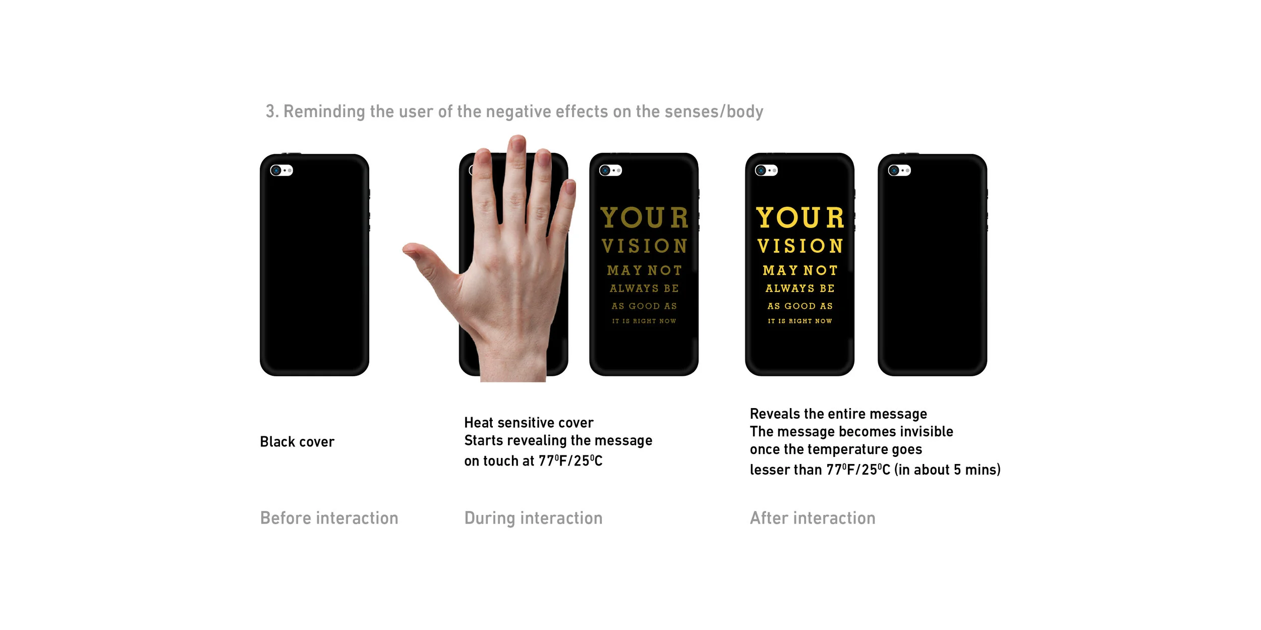
Based on user feedback, I realized just changing the color is not enough. It could mean anything. It needs to be a specific nudge. What better than visuals? And what keeps you away from certain things? Fear! So I decided to combine the two and created visuals of thinbs one might have a phobia of. I also created some options with text for a more subtle nudge.
Hi-fi Prototype
Adding final touches and making the visuals realistic
Gaining insight from the low-fi prototype, I further refined the designs to look disruptive and more off-putting to persuade the user to avoid excessive usage of the cell phone. These covers could be custom-made depending on what fear or message the teenager wants.
Learnings and Takeaways
The solution lies within
I realized that finding solutions to problems is not about introducing new things to solve the problem but about repairing what is broken inside. This also made me the realize the importance of iterating our ideas.
User testing required
The hi-fi prototype was not tested. Taking this project further, I would love to test it with the users and analyze if it works or not, and if it does, upto what extent.


