Placemaking Week Website Redesign
OVERVIEW
A website revamp to provide easy access to information and entice potential attendees
Placemaking Week (a subset of Project for Public Spaces) is a weeklong global gathering of placemakers that emphasizes hands-on learning and innovative social events, while leaving behind a public space legacy in local and international host cities.
I was part of this ambitious project to redesign the desktop and mobile website with focus on restructuring and refreshing the website's visual identity in order to attract potential student attendees (new and returning).
CLIENT
Project for Public Spaces’ Placemaking Week (worked with Pratt Institute’s Center for Digital Experiences)
TEAM
Hiral Parekh, Jonathan Duxbury, Xi Yang, Ian Gregory
GUIDE
Prof. Nancy Smith
TOOLS
Figma, Balsamiq, Optimal Workshop
TIMELINE
14 weeks, Spring 2020
PROBLEM
Inconsistent information structure and excess of information - an obstacle in event sign-ups
The Placemaking Week website is currently bogged down with substandard user experience causing confusion in providing website visitors an easy access to valuable information.
This discourages users to sign-up for and attend the organization’s thought-provoking international and local events.
Existing Placemaking Week website
My Role
Researcher: Gathered initial insights by facilitating 5 in-person interviews, conducted a survey and created the persona (collaborated with the team members for user research).
UX Designer: I created the low and high fidelity mockups of the digital interfaces of the website. Carried out 3 remote usability tests with potential application users to gather insights to improve the design.
Visual Designer: I redesigned the screens and revamped the visual design of the website.
Solution
A responsive website with structured event information, thereby attracting potential attendees
This redesign is built on the idea that Placemaking Week should entice more website visitors to become event attendees with clarity of information.
APPROACH
Research + Design + Test + Iterate
We relied on the questionnaire analytics in conjunction with 15 interviews and 8 usability tests which allowed us to gain deeper understanding through combining both qualitative and quantitative information and iterate further.
KICK OFF
Initial insights from client meeting
The client's main aim was to increase the number of potential attendees for the international event and fix the confusing navigation.
USER GROUP
Architecture Students interested in Urban Placemaking
We realized we should target the academic sector. Architecture students are an important user group because they already have a basic idea of what placemaking is and would be curious in delving deeper into the field through the medium of the placemaking week events.
Research Method
Online questionnaire, user interviews and user testings
We conducted a user survey along with user interviews and tested the existing website with 15 participants. Our goals were to better understand their usage and the challenges they face using placemakingweek.org.


Pain Points
The website’s consistent inconsistency and excess information
Although users were able to sign-up for events, they continued to struggle with excess of information and a confusing navigation.
“This website is off-putting…I know placemaking and everything about PPS is so interactive but this placemaking week website lacks that soul. It has too-much text and it doesn’t very loudly tell you that read the conference report. I could have easily missed that.”
Discussions with users revealed the following loopholes in the current design:

Delay in understanding what the
website is about
The landing page does not talk about what Placemaking Week is and so it took a while for some users to understand what the organization did and what the purpose of the website was.

Inconsistent navigation leading to unorganized content and confusion
The website navigation did not follow the same structure. There was a point where the navigation was lost altogether and the user was forced to use the ‘back’ button instead.

Excess of information making the user grasp too-much at one glance
The website at first glance is very text-heavy and seems exhausting. Not all users wanted to spare so much of time.

Easily missed Call to Action button
The Call to Action buttons throughout are not eye catchy enough. They can go easily unnoticed.
User Persona
With the demographic and psychographic research so far, I identified the below data-driven persona whose user experience is likely to improve after the redesign.
Aaria Verma
25 years
Urban Placemaking and Design Management student
- Outgoing, curious, organizer, and an explorer
- Enjoys networking and being exposed to new ideas
- Would like to attend a placemaking event to gain knowledge, interact and enhance her presentation skills
- Hopes that the event is affordable for her
The Makeover
Organization is key
It was clear that fixing the existing site map was a priority. Our high level goals were to -
- Group categories as per user’s mental model
- Make it fast and easy to use for everyone
- Avoid having too many categories that will confuse the users
Card Sorting
So, we created 42 cards to be sorted into categories by users and conducted an online card-sorting exercise to find the user's mental model of content categorization.
Tree Testing
Using the data from card sorting, we laid out 5 tasks to be performed as a part of tree testing to further refine the site map. This helped with the categorizing of the FAQ section.
Navigation Tree laid out for the testing
Tree Testing results for the 5 tasks
Analysis of Tree Testing
New Information Architecture - A sequential structure
Placemaking week’s redesigned information architecture uses a sequential structure. The users go step-by-step through content to accomplish the task they need. The aim was to inform the users first and then encourage them to register for the event.
Redesigned information architecture based on card sorting and tree testing
MIND ON PAPER
Sketches
Based on research, I knew an onboarding experience would be necessary along with a sleek and minimal design, so I sketched out basic wireframes accordingly.
Initial sketches
User Testing
Low-fidelity wireframes
In building wireframes, we wanted to ensure a consistent and user-centric flow of movement throughout the process.We used Balsamiq Mockups to quickly create low-fidelity mobile and desktop prototypes.
Low-fidelity desktop prototypes by Jonathan and myself, mobile prototypes by Cassie
Usability Testing
We tested the following tasks remotely with 8 users using Steve Krug's think-aloud method.
Desktop Prototype Testing -
1. Get onboarded to Placemaking Week website
2. Find out how to apply for a scholarship to attend the 4th International Placemaking Week
Mobile Prototype Testing -
1. Get event details on the Opening Reception + Mayor’s Welcome
2. Register to attend the 4th International Placemaking Week 3. Find information about the 2017 International Placemaking Week in Amsterdam
New Insights
In the new design, the users were able to find content without getting confused or lost at any step. Additionally, the following new insights inspired further improvements -
5 users found the on-boarding experience informative and enticing while the rest found it disruptive
Sub-navigation bar on the desktop home page was confusing
The Upcoming Events Page on the mobile version was quite successful and helpful for the users
More contrast between Learn More button and the image behind it suggested
SETTING THE MOOD
Revamping the Visual Design
The website was redesigned with the aim of reviving the original identity of the organization with minor revisions in categories like layout, color palette, typography and iconography.
(Presentation Style Reference: Google Material Guidelines)
Responsive Grid System
All pages use the same responsive grid, which has flexible columns and padding that can resize depending on the screen width.


Color
The new design has adopted a color theme with three primary colors - orange, black , white, and 2 secondary colors - dark blue and light blue. This theme allows Placemaking Week to stay close to its parent brand PPS and still have it’s own identity and present readable, distinct information.
Placemaking Week’s color theme
Typefaces
The new design uses two typefaces:
1. Merriweather
2. Lato
1. Merriweather
2. Lato
Type Scale
This type scale provides the typographic variety necessary for the mobile and desktop content. Most copy is set in Lato, though Merriweather is used for headlines and sub headlines.
Placemaking Week’s mobile and desktop type scale
Iconography
We took the approach of using recognizable, functional icons that don’t have customized, distinguishing characteristics or ornament. By not giving their icons branding or distinct style, they can be paired with any content of any tone.
1. To create consistency, all of Placemaking Week’s icons share the same underlying grid structure
2. A collection of Placemaking Week’s icons
TRIAL & ERROR
Initial failed designs
Focusing on the feedback from the onboarding experience, I started working on a couple of iterations for the the initial mobile screens. Some of them seemed confusing, some were difficult to read.
Iterations
FINAL Avatar
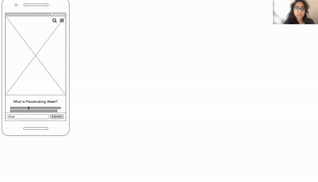
Mobile first, Desktop second
After an extensive groundwork process and couple of iterations, we moved on to creating the final design for the mobile version first and then adapted the layout to desktop version. Below are the hi-fidelity screens for the same.
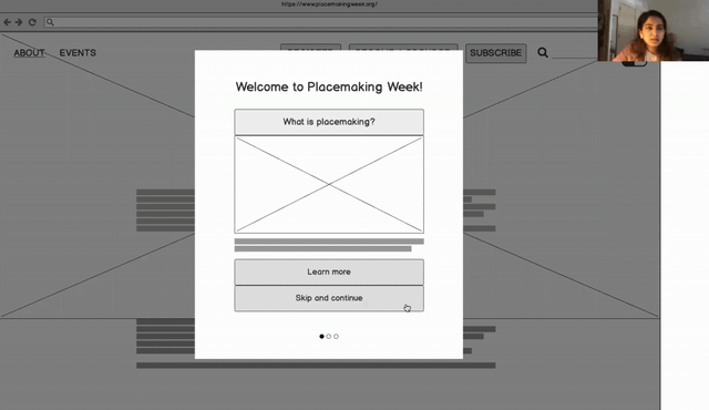
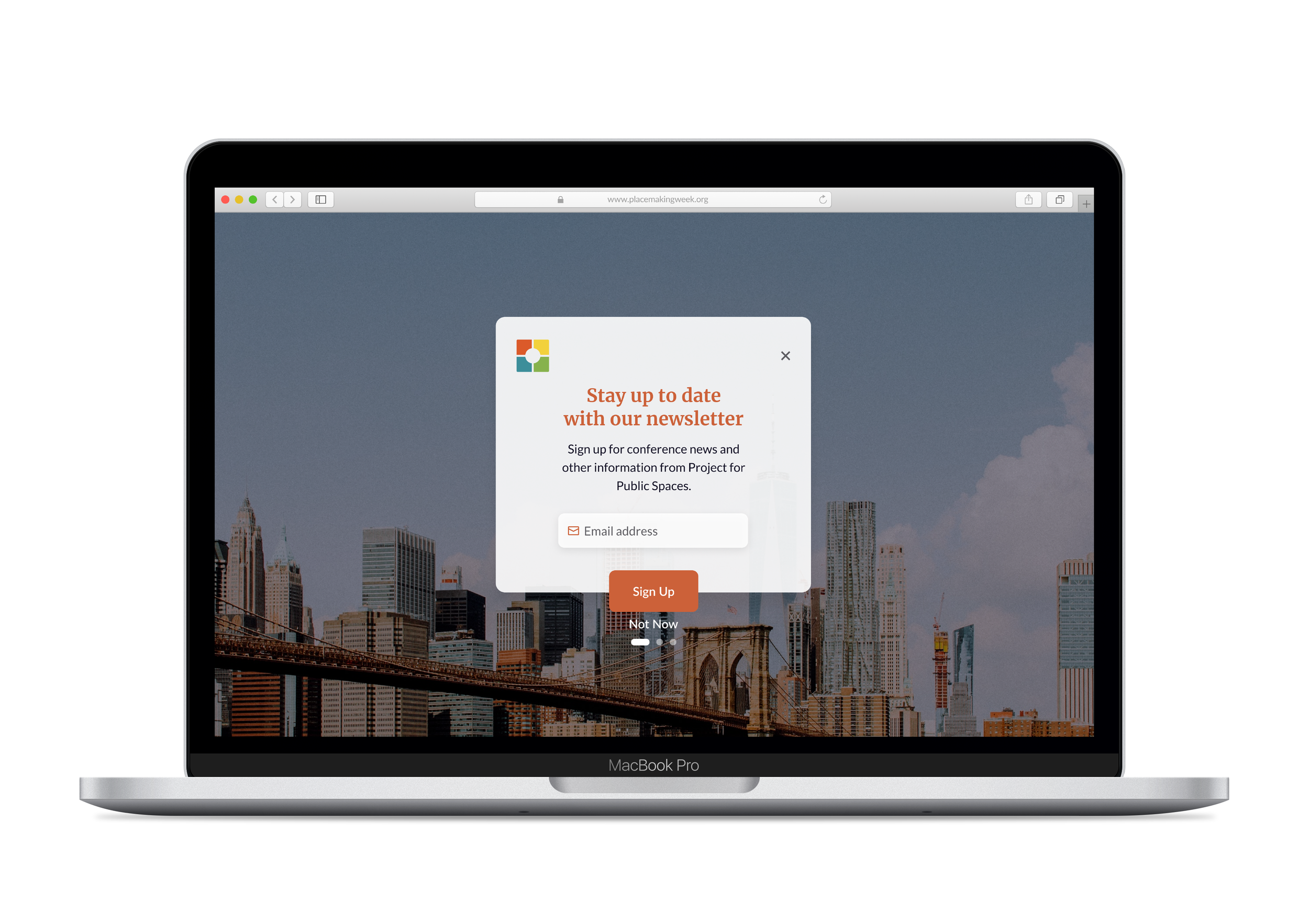
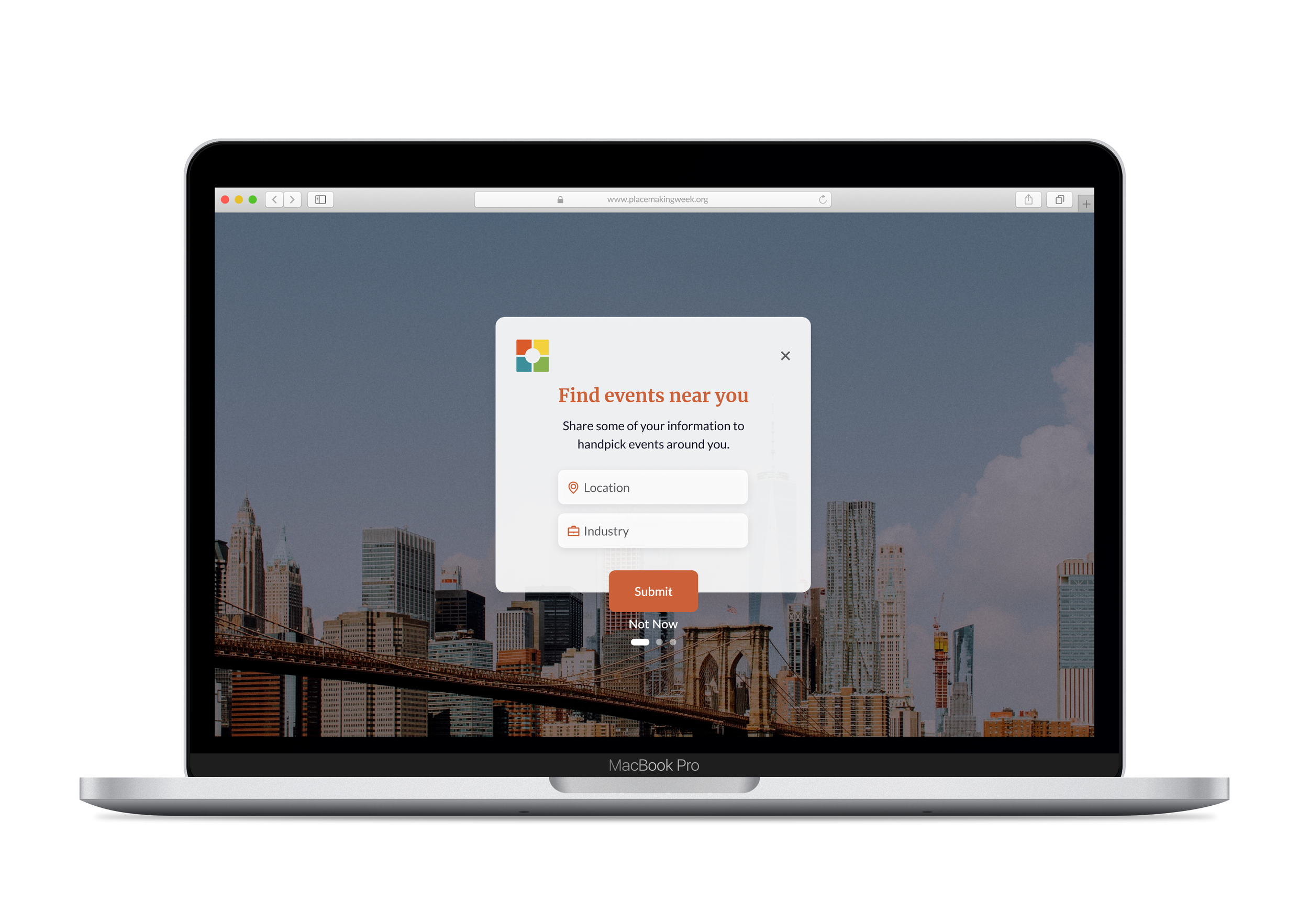
New Users
Welcome the new users and onboard them to the website features and purpose


Home Page
Explain what is Placemaking and Placemaking Week along with Events and FAQs
Upcoming Events
Upcoming Events Page with an option to look at the itinerary and attendees list


Past Events
Show Past Events through Conference Reports
Registration Page
Guide through the Registration Process along with Scholarship Details and Refund Policy


Before/After
Desktop Version

Before & After
Client Face Off
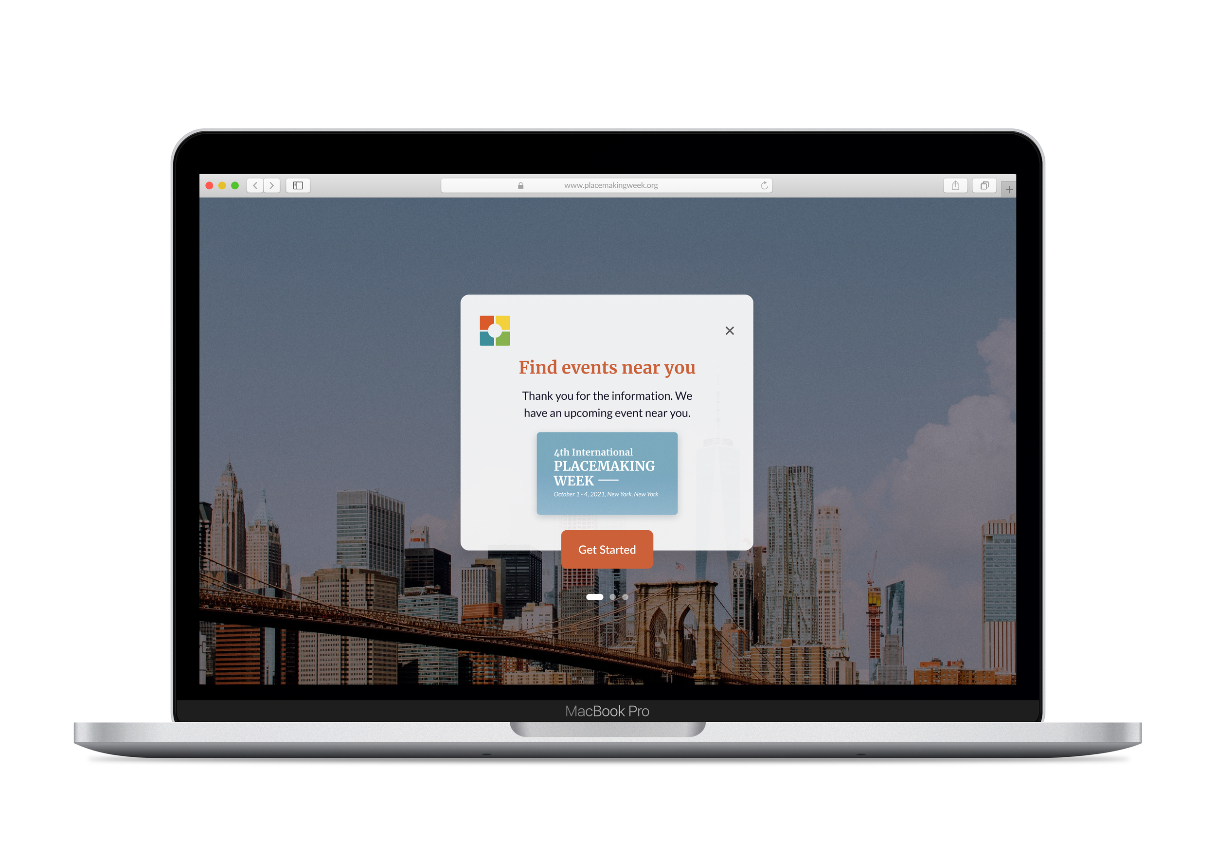
Onboarding - the Show-Stopper
During the final meeting with the client, we presented our redesign as a team. The onboarding feature stole the show. The clients appreciated that feature, especially the ‘Events near you’ concept along with the subtle change in the color palette and well thought-out navigation.
Learnings and Takeaways
Great beginning, lots to do more
It was incredibly rewarding to take on a problem and create a solution for a website that so many users will benefit from. This redesign is just the beginning. I would like to still improve upon the UX based on further user testing.
Creating a Style Guide
Redesigning placemaking week website pushed me to create a whole style guide: color palette, typography, an onboarding experience, and a mobile and desktop interaction which can be uplifted to a design system.
Less is more
With this project I learned how necessary it is to understand the user's goals to know which information is the most important. Identifying what causes confusion and realizing when to weed it out allows for ultimate ease and functionality.
Don’t let the constraints constrain you
Time was a constraint and the Covid-19 situation in the middle of the project didn’t make things easy either. But we took advantage of the digital tools we had and continued to work hard and achieve results.