Redesigning the Education Experience
for Children with Blindness
Overview
Designing technologies that empower and provide companionship
I worked on this ambitious project aimed at differently designing the education experience of children with blindness; one that is focused on providing them with a sense of ownership and also companionship while using technology.
My Role
UX Designer
Tools
Adoobe Illustrator, Sketchup, Adobe Photoshop
Timeline
April 2019 - May 2019
Opportunity
"I find reading with machines a very lonely process"
This is what blind since birth, Ron McCallum said in his TED Talk 'How Technology allowed me to read.' He is one of Australia's most respected legal scholars, and an activist on behalf of disabled people around the globe.
Out of 45M blind people in the world, 1.4M are children. Although technology has a lot of influence on our environment, and is revolutionizing and improving the lives of the visually impaired, there is a need to inculcate human interaction. This works best if implemented from childhood.
Goals
A balance between technology and human interaction
Goal 01
Provide children with blindness a chance to communicate in a fun and interactive way using Braille
Goal 02
Let language not be a barrier to gain knowledge for children with blindness
Goal 03
Make learning less stressful with assistance from teachers and human interaction with other children with blindness
Context
Community center with interactive technology for children with blindness
This project is located in a community center atmosphere with clever devices that provide blind children a chance of effective education. Central to the Braille writing and reading system, this project demonstrates a multi-sensory approach that can help 5-12 year old blind children to be among other blind children and build companionship and integrate into the society as seamlessly as possible with the hope of providing a sense of belonging.
Outcome
3 clever technologies that support and allow for human interaction
These technologies are designed to be used inside the community center only and not to be sold loose. The idea behind this is that this will result in theses technologies to be used in a social setting only and will encourage human interactions.
Learn to read, write and chat in Braille
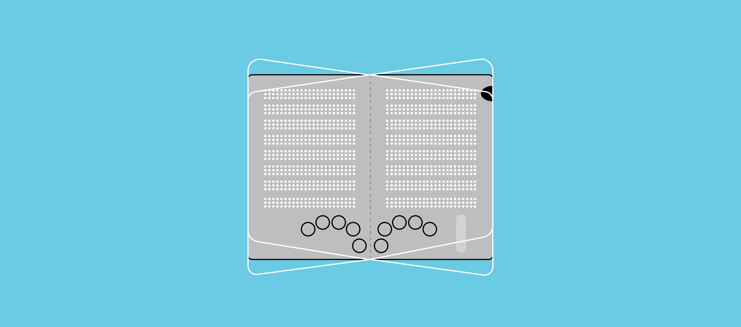
The Smart Braille Tablet (comes with a headset) can be used both sides, in both orientations and has raised dots allows children to read and type using a Braille keyboard and also chat with the other children at the community center
Scan and read multilingual text
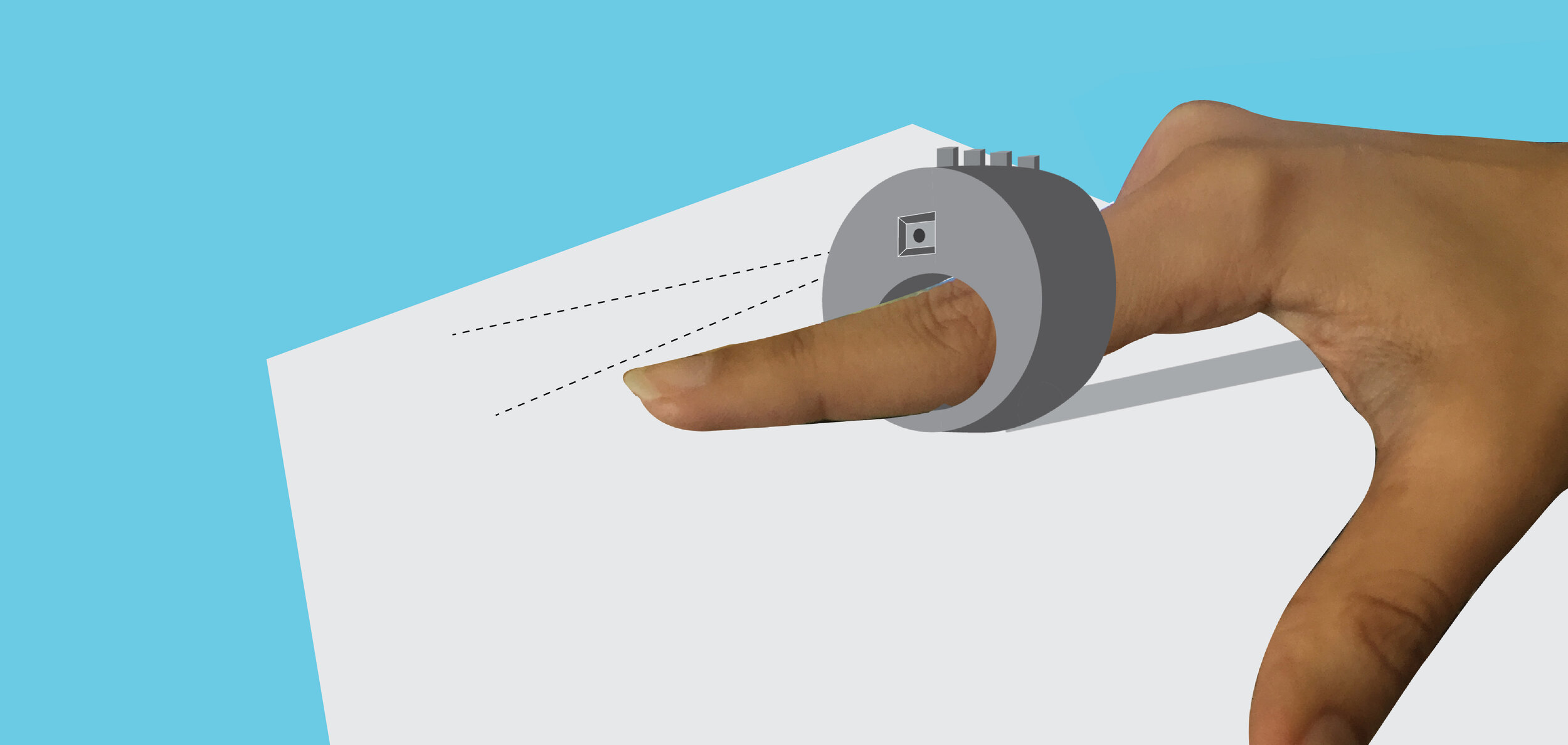
The Smart Scanner (comes with a headset) is a finger mounted device with a camera that can scan text in 36 different languages and multiple fonts, translate into audio and can also save the scanned text which can be later transferred to the Braille Tablet in the form of Braille
Learn and grow in a social setting
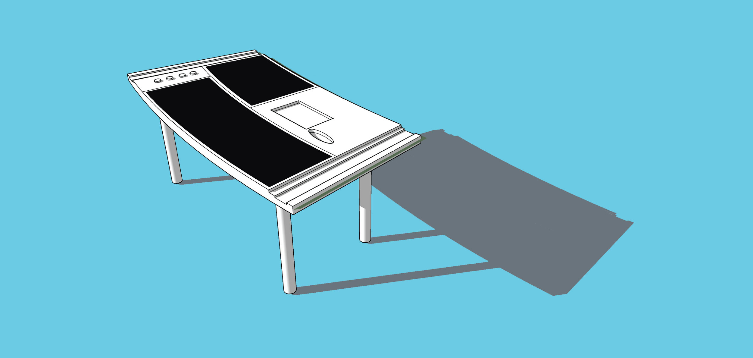
The Smart Reader is a study table with hand rollers on both sides for resting the hands, space to store the Smart Braille Tablet and Smart Scanner and is designed to be placed in a circular setting with other tables to allow teachers and other children to interact
LET’S DIVE DEEPER
Process
Empathise + Desk Research + Ideate + User Journey + Design + Prototype
It all started when I came across a TED Talk by Ron McCallum. Blind almost since birth, he is one of Australia's most respected industrial and discrimination lawyers and a prominent human rights advocate.
In the charming, moving TED talk, he shows how he reads -- and celebrates the progression of clever tools and adaptive computer technologies that make it possible. What caught my attention the most is when he said "I find reading with machines a very lonely process." I empathized with him and this is when I decided to design technologies for the blind that provide them with a sense of belonging, ownership and also companionship.
I started with desk / online research.
Desk Research
Focus on Braille
First introduced in 1824 by a Frenchman Louis Braille, it is a system of touch reading and writing for blind persons in which raised dots represent the letters of the alphabet. It also contains equivalents for punctuation marks and provides symbols to show letter groupings. Braille is read by moving the hand or hands from left to right along each line.
Reading and writing is the basis of education and so Braille was going to be a central point in the designs. I started understanding how the system works from online resources.
Target Audience
5-12 year old children with blindness
5-12 is the golden age where children can easily grasp new things and so the target audience is blind children within this age group.
Ideation
All round development using smart technologies
I wanted to build upon existing technologies like Braille tablets and speech synthesizers to add a more interactive side and human touch so that there is social and cognitive growth. The context was that of a community center with educative technologies for children with blindness under adult supervision of course.
User Journey
Community center, and children with blindness and their parents
The user journey did not only involve the children but their parents and the community center folks formed an important part to. The parents were the first contact points of the community center since they would have their concerns and should be convinced to let their children study at the community center. Below is the entire journey from being aware of such a concept to what the result of such an education would be.
User Journey
Design Touchpoint 1
Smart Braille Tablet
The Smart Braille Tablet is a strong tool in the hands of the blind children to help them provide a smart way of learning and interacting. I designed a two-sided, foldable Smart Braille Tablet that will enable the blind kids to read and write with a supporting audio. The Smart Braille Tablet will also have a function of using Google dictionary as well as chatting with other blind children at the community center.
Sketching
I started with initial sketching and deciding on the site map.
Smart Braille Tablet ideation and sketches
Smart Braille Tablet user flow
Wireframing and Low-Fi Prototyping
I made wireframes to decide on the basic look and user flow of the tablet. It helped me in deciding what features will play out in which way.
Smart Braille Tablet wireframing
I tested the low-fi paper prototype with 5 of my friends. I asked them to close their eyes and made them learn how the keyboard works and then asked them if this is something the blind kids will be able to adapt. This helped in understanding the functioning of the tablet.
Smart Braille Tablet low-fidelity prototype tried with 5 users
Hi-fidelity Prototype
The Smart Braille Tablet uses a Braille keyboard to function and navigate and a headset for listening. Though the Smart Braille Tablet looks similar to tablet-style devices, its glass at the top is perforated into a grid with holes that allow liquid-based technology to present content in Braille. The screen can change it’s orientation as per the kids’ handling and can be used for chatting with other kids in the community center.
Smart Braille Tablet hi-fidelity prototype
Design Touchpoint 2
Smart Scanner
The Smart Scanner enables the blind children to scan and read multilingual books with the help of a camera sensor and headphones.
Sketching and User Flow
I started sketching and iterating how the device would work and what features would it have.
Smart Scanner ideation and sketches
Smart Scanner user flow
Hi-fidelity Prototype
This finger mounted device when run over a book, scans it and translates it into an audio for the blind kid. Additionally, it also has an option to record the book reading and transfer it to the tablet in the form of Braille for future use. This Smart Scanner has an adjustable anchor (taking inspiration from a measuring tape) to help the blind kid maintain a 90 degree so that the device can scan complete sentences.
Smart Scanner hi-fidelity prototype
Design Touchpoint 3
Smart Reading Table
The Smart Reading Table with tactility for identifying different sections of the table is designed to be placed in a social setting and increase social interactions among the children and their teachers. This is the technology where the previous 2 technologies come together.
Sketching
I started with sketching out different versions of the table and how its setting would be like. I wanted to have a social setting with access for teachers and friends from the community center.
Smart Reading Table ideation and sketching
Hi-fidelity Prototype
The Smart Reading Table has space for books, Braille Tablet and the Smart Scanner as well. It also has hand rollers on both the sides for hand massages and has elevated Braille markings to recognize what part of the table is for what thing.
Smart Reading Table hi-fidelity prototype
Interestingly, the tables are set in a circular format where each child sits diagonally across the other child and there are openings for teachers to supervise and assist.
Circular formation of the Smart Reading Tables
Learnings and Takeaways
Real user testing needed
For this project to be validated and successful, it requires to be tested by real users and then iterated further. This project is incomplete without it. It is currently based on online research and certain biases.
Empathy is not enough
This project made me realize that having empathy for my users was a key element while designing. Putting myself in their shoes was very helpful. However, interacting with users is equally important. Getting to know their pain points and needs and being part of their journey is not that easy. It requires multiple iterations.


